
ULINE: Settings Page Redesign
Applying UX Design thinking in order to redesign the company's website settings page.
.avif)
Final Settings Page
Overview
ULINE is the leading distributor of shipping, industrial and packaging materials to businesses throughout North America.
In collaboration with Purdue's UX Design program, ULINE asked our team to redesign the settings page on their website. The page had been hastily built for only functionality without ever being assessed from a design perspective backed by research.
Contributions
Our team consisted of 9 people that were all undergraduate students. Contributions I made to the project were:
-
Research
-
Interviews
-
Ideation
-
Documentation
User Group
Employees who make purchases through ULINE's website predominantly on behalf of large businesses.
Team
Alex McCausland
Ann Kurian
Daphnee Delisha
Faye Ochi
Jack McCarthy
Jaden Duong
Kellen McClain
Mina Mayerczak
Minkyu Lee
Duration
16 Weeks
Spring Semester 2024
Jan - May
Tools
Figma
Whimsical
Miro
Milestone 1
""How might we gain a foundational understanding of core use cases and stakeholders?""
01
Analytics
Analyzing data provided by ULINE, we identified no current correlation between a setting’s position on the page and its click rate.

Overview of Some Click Analytic Data
02
Competitive Analysis

Overview of Competitive Analysis
To better understand how other companies design and organize their settings pages, we investigated a number or competitors, including but not limited to:
-
Grainger
-
Zoro Industrial
-
McMaster Carr
-
Global Industrial
Each settings page was evaluated using a consistent set of criteria, such as overall layout and the inclusion of specific features like text message notifications.
Findings
-
Most competitors used a similar layout, which differs from Uline’s current design.
-
A common pattern was a vertical sidebar listing the primary settings categories.
-
Across the board, settings were organized into clearly defined groups, and many interfaces used boxed sections to visually separate different categories.
Milestone 2
""How might we evaluate Uline’s current Settings page to determine whether it aligns with user wants and needs?""

Heuristic Analysis Process
Heuristic Analysis
01
To evaluate the page’s usability, the team performed a heuristic review using Nielsen’s 10 Usability Heuristics. The purpose of this assessment was to identify both effective design elements and areas that created friction for users, helping reveal opportunities for improvement.
Findings
Successes
-
Additional information is available if the user is confused about the use of some settings.
-
Visual indicators display a notification when a user changes any of the settings.
-
Very minimal design, nothing unnecessary that distracts the user
Pain Points
-
No organization of settings.
-
Radio buttons may be perceived as visually unappealing.
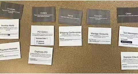
Card Sorting Activity
Findings
-
Categories based on functional similarity were often grouped together
-
For Example:
-
Payment/Checkout
-
Account Management
-
Purchase Orders
-
Notifications
-
-
-
Participants lacked context for some of the settings
02
Card Sorting w/ Users
Findings from both the competitive and heuristic analyses suggested that organizing settings into groups could improve the overall experience. To better understand users’ preferences for how these settings should be structured and categorized, the team conducted a card sorting activity.
Findings from both the competitive and heuristic analyses suggested that organizing settings into groups could improve the overall experience.
To better understand users’ preferences for how these settings should be structured and categorized, the team conducted a card sorting activity.
Milestone 3
""How might we use our findings, along with design thinking, to redesign the current page for a more efficient user experience?""
Lo-Fi Wireframing
01
Once our research was complete, the team began developing design concepts. Each member created a low-fidelity (lo-fi) wireframe, resulting in nine unique designs. We reviewed each concept together, identified the strongest features, and merged our favorite ideas into a single wireframe.

Final Lo-Fi Design
Mid-Fi Wire-Framing
02
Once the team had agreed on a design to move forward with, we began wire-framing using Figma.
Sponsor Feedback
-
Provide additional context on each setting.
-
Increase the font size of the main category heading so it shows the user different categories.
-
Bold the headings within the boxes so they stand out.
-
Previous user testing proved that users preferred the current location for "Manage Multiple Accounts", so this added feature can be removed.
-
The cards look unbalanced going from a row of 3 to two rows of 2.
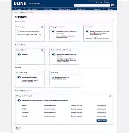
Mid-Fi Design Prior to Feedback
Final Design
Key Differences
-
Using boxes to visually separate different settings throughout columns.
-
Columns help reduce amount of scroll.
-
-
Grouping settings into categories for easy navigation.
-
Toggles instead of radio buttons to save space and look more visually pleasing.
-
Editing the copy on some settings to provide users with more context.
-
Fixing design inconsistencies.
-
e.g. the back button on this page was inconsistent with other Uline webpages.
-
To evaluate the effectiveness of our redesign, we conducted efficiency testing with several of our peers and compared their performance to the original webpage. The results showed that participants completed tasks 38.25% faster using our redesigned interface.