
Donate Equity:
Onboarding Refinement
Utilizing UX Design in order to make the onboarding process more comprehensible.

Final Dashboard Design
Overview
DonateEquity is a platform that helps nonprofits accept business equity donations by guiding organizations through a complex donation process.
In collaboration with DonateEquity and Purdue University's UX Design program, our team was tasked with redesigning the platform's onboarding experience to better support nonprofit leaders. Through user research and iterative design, we created a more intuitive experience that accommodated different levels of knowledge while improving platform navigation and learning.
Contributions
Our team consisted of 6 people that were all undergraduate students. Contributions I made to the project were:
-
Research
-
Ideation
-
Design
-
Documentation
User Group
Non-Profit executives that don't have the necessary knowledge to effectively process equity donations.
Team
Thomas Carlock
Daphnee Delisha
Macy Bosworth
Kellen McClain
Avery Dellinger III
Maddie Nikolai
Duration
16 Weeks
Fall Semester 2025
September - December
Tools
Figma
FigJam
Canva
Milestone 1
""How might we get familiar with the project, including past semester's work? What research can we do on the process we're trying to educate users about?""
01
Project Retrospective
In order to establish familiarity with the project to know what areas to improve upon, we reviewed and analyzed the previous semester's work to understand the existing onboarding experience, identified remaining challenges, and determine where the project could be improved.
Findings
-
The previous onboarding focused more on explaining equity donations than teaching users how to navigate the platform.
-
There was an opportunity to create a more complete onboarding experience by introducing
platform-specific guidance.

Compiled Insights From the Activity
02
Secondary Research
To gain a deeper understanding of topics related to the project as well as identify root issues and find potential solutions, we researched:
-
For-profit vs Nonprofit Fundraising
-
DonateEquity as a Company
-
Applicable Tax Advantages
-
Methods of Giving
By researching these topics, we were able to build foundational knowledge and inform design decisions.
Findings
For-Profit vs Nonprofit Organizations
-
For-profits sell products/services to generate revenue, while nonprofits rely on fundraising and donations.
-
Nonprofits focus on community or humanitarian goals and may receive IRS tax-exempt status.
-
Donors to nonprofits may receive federal tax deductions for eligible donations.
For-profits can support causes but are not tax-exempt. -
Donations to for-profits are generally not tax-deductible.
DonateEquity as a
Company
-
DonateEquity connects donors with nonprofit leaders to simplify equity donations to 501(c)(3) organizations.
-
Allows investors and entrepreneurs to donate non-voting business interests before a sale.
-
Provides potential tax benefits, including deductions and reduced capital gains taxes.
-
Focuses on making complex donation processes more accessible and user-friendly.
-
Emphasizes education and simplifying charitable giving.
Applicable Tax
Advantages
-
Donating toward charities has great tax benefits.
-
The primary purpose of charity tax deductions is to reduce your taxable income.
-
Donations to 501(c)(3) public charities qualify for an itemized deduction from income.
-
There are also many benefits to donating stock. If one donates the stock directly to a charity, there’s no capital gains tax to pay.
Methods of
Giving
-
In-kind donations provide non-monetary support through goods, services, or volunteer work.
-
Cash donations (workplace giving, call-to-give) are common ways to financially support nonprofits.
-
Stock donations allow donors to support nonprofits while gaining tax advantages.
-
Equity donations can avoid capital gains taxes and provide deductions based on stock value.
-
Cash donations may reduce taxable income up to 60% of adjusted gross income (AGI).
03
Comparative Analysis
In order to understand onboarding structures and opportunities from other onboarding experiences, we evaluated similar platforms including but not limited to:
-
Betterworld
-
Robinhood
-
Patreon
The process helped identify successful patterns, educational strategies, and opportunities to improve DonateEquity's user experience.

Compiled Findings From the Analysis
Findings
-
Successful products relied on step-by-step onboarding, FAQs, and contextual help.
-
Video tutorials and guided learning made complex information easier to understand.
04
Cognitive Walkthrough
In order to evaluate the ease of navigation for the current prototype and ensure users can navigate through the onboarding process, the team observed users interacting with the existing prototype to uncover usability issues, navigation challenges, and gaps in the onboarding experience.
Findings
-
Users struggled to understand certain navigation elements and platform features.
-
Progress indicators, clearer icons, and guided walkthroughs would improve usability and confidence.
Milestone 2
""How might we design for different knowledge levels and learning styles within the nonprofit executive persona?""
01
Secondary Research
Beginning Milestone 2, we first wanted to:
-
Recognize how different learning approaches can cater to the needs of various users.
-
Discover different tools to that could enhance learning value within the onboarding process.
Based on this criteria, we conducted research on learning styles and instructional design to better understand how users learn complex information and how onboarding could support users with different levels of experience.
Findings
-
Users learn best through a mix of videos, text, and interactive guidance.
-
Breaking information into smaller steps improves understanding.
-
Contextual learning is more effective than presenting everything upfront.
-
Designing for beginners creates a more accessible experience for all users.
02
Persona Creation
In order to clarify and define the needs, goals, and motivations of users through the use of personas, and to demonstrate how these needs evolve depending on varying levels of knowledge, we developed personas representing:
-
Novice Nonprofit Leaders
-
Intermediate Nonprofit Leaders
-
Advanced Nonprofit Leaders
With these personas, the team was able to better understand their goals, frustrations, and learning preferences.
Personas
Novice Persona
Ben
A nonprofit executive with little to no experience in equity donations who needs clear guidance, educational resources, and step-by-step support throughout the onboarding process.
Intermediate Persona
Jane
A fundraising professional familiar with traditional donations but new to equity donations, seeking a balance of educational content and efficient tools to complete tasks confidently.
Advanced Persona
Sarah
An experienced nonprofit leader with a strong understanding of fundraising who values streamlined workflows, quick access to resources, and minimal onboarding interruptions.
Findings
-
Users entered the platform with vastly different levels of knowledge.
-
Designing for beginners would create an experience that remained useful for more experienced users.

Empathy Map for Novice Persona (Ben)
03
Empathy Mapping
After creating the personas, the team agreed we needed to gain a deeper emotional understanding of each persona's thoughts, feelings, and behaviors during the onboarding process, uncover specific pain points or frustrations relating to learning styles, and enhance the personas by addressing their cognitive and emotional needs.
With these goals in mind, we mapped each persona's thoughts, feelings, actions, and pain points to uncover opportunities for a more supportive and user-centered onboarding experience.
Findings
-
The novice persona needed reassurance, clear guidance, and educational resources to build confidence.
-
The intermediate persona wanted a balance of learning materials and efficient workflows to expand their existing knowledge without slowing them down.
-
The advanced persona prioritized speed, streamlined navigation, and quick access to tools over extensive onboarding content.
04
Ideation & Sketching
Once the team had a better understanding of how personas with varied levels of experience would think, we thought the next best goals to tackle were:
-
First, refine the onboarding and dashboard design.
-
Second, explore multiple approaches to find the best option.
-
Third, share design changes with team and stakeholders.
Based on these goals, we generated and refined multiple design concepts that addressed research findings while exploring improvements to navigation, learning resources, and platform functionality.

Example of an Initial Dashboard Sketch
Findings
-
Breaking complex workflows into manageable steps improved usability.
-
Early concepts helped identify where educational resources and tools should be placed throughout the platform.
Milestone 3
""How might we design the on-boarding process for DonateEquity to maximize user engagement and satisfaction?""
01
Prioritization Workshop
For the third milestone, the team first wanted to identify which features are most important for the onboarding process as well as which concepts and requirements would be the most and least beneficial.

Based on these factors, we facilitated a prioritization workshop with our project sponsor, where features from the existing prototype and new design concepts were categorized into Must Have, Should Have, Could Have, and Won't Have based on their importance to the onboarding experience.
Template for Prioritization Workshop
Findings
-
Onboarding guidance and task management were identified as the highest-priority features.
-
Educational resources and calculators were viewed as essential for helping users understand the equity donation process.
-
Stakeholder feedback helped focus the redesign on the features that would provide the greatest value to users.

Results from Workshop
02
Value Matrix
Following the Prioritization Workshop, the team's next step was to identify the most important features to develop, evaluating each concept by its effort required and value delivered to the onboarding process.
We chose to create a Value Matrix in order to evaluate high-priority features based on their impact and implementation effort to determine where design resources should be focused.

Final Value Matrix
Findings
-
The dashboard, project workspace, and calculator offered the greatest impact while remaining achievable within the project timeline.
-
Focusing on high-value improvements allowed the team to maximize usability with limited time.
03
User Flows
Next, we agreed it was best to define the step-by-step journey users take throughout the prototype and refine the user flow to support users with diverse learning styles and background knowledge.

Previous User Flow
Changes
-
Relocating tools closer to where users needed them reduced unnecessary navigation.
-
Integrating progress tracking into tasks made the workflow easier to follow.

Final User Flow
Final Design

Example Image of Platform Tutorial
01
Mid-Fi Prototype
Using insights gathered throughout the previous milestones, our team developed a mid-fidelity prototype that reimagined DonateEquity's onboarding experience.
The prototype introduced a redesigned dashboard, learning, project, and calculator pages, along with a guided platform tutorial to better support users with different knowledge levels. Educational video guides were also incorporated to explain both the concept of equity donations and the donation process, creating a more intuitive and supportive onboarding experience.
Every design decision was informed by user research and prioritized stakeholder feedback, resulting in a more intuitive and educational onboarding experience.
Findings
-
Integrating educational resources directly into the workflow improved accessibility and reduced uncertainty.
-
Guided tutorials and instructional videos helped users learn both the platform and the equity donation process.
-
The redesigned prototype better supported novice, intermediate, and advanced users.

Video Guide for the Concept of Donate Equity
02
Design Rationale
Each redesign was grounded in research findings and user feedback rather than visual preference alone. The team focused on simplifying navigation, reducing cognitive load, and providing flexible learning resources that supported different user needs.
This way, we ensured every interface change addressed a specific usability issue identified throughout the project.
Findings
-
Research consistently supported contextual guidance over static documentation.
-
Supporting multiple learning styles improved the overall onboarding experience.
-
Small, research-driven improvements collectively created a more intuitive platform.

Previous Calculator Design
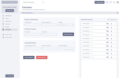
Improved Calculator Design